Movie Ticket Checkout
Rethinking the way we purchase a movie ticket at Megaplex Theaters
Challenge:
The checkout touches every guest, making it both our highest-impact opportunity and highest-risk redesign. We needed to comprehensively reimagine every page to make the ticket-buying experience seamless for thousands of daily users.
Role:
Trevor Allen as UX/UI designer in collaboration with Henrique Tedeschi and his dev team (including Daniel Cruz and Deploy Vision)
Tools:
Figma, Photoshop, Wordpress
Overview:
Megaplex's checkout process was creating unnecessary friction for moviegoers eager to secure their seats. With an aggravating amount of clicks standing between customers and their tickets, the outdated interface was leading to abandoned carts and frustrated users.
We completely reimagined the checkout experience, modernizing the design, streamlining the flow, and researching industry standards to create an intuitive platform.
The result: checkout clicks were reduced from 12 to just 5.5 for two tickets, and conversion rates within the checkout doubled! This comprehensive redesign not only simplified the purchase journey but also introduced new features such as flexible payment options that customers actually use, with Apple Pay and Google Pay now accounting for nearly 40% of transactions.
Approach:
Our guiding principle was simple: buying a movie ticket should be "grandma-proof." If elderly guests with limited tech comfort couldn't navigate the checkout confidently, we hadn't succeeded. This meant eliminating redundancies, consolidating information, and reducing clicks by half.
Every decision prioritized clarity and intuitive flow over complexity. Beyond simplification, we needed to signal that movie theaters aren't relics of the past, our outdated interface was reinforcing the wrong narrative. The rebrand brought modern design sensibilities through updated fonts, colors, and layouts that aligned with Megaplex's refreshed identity.
We conducted extensive competitive research, analyzing checkout flows from major national cinema chains as well as leading third-party ticketing platforms. The goal wasn't just to match industry standards but to surpass them, identifying gaps, borrowing inspiration, and introducing new features that reimagined what a movie ticket purchase could be.
This wasn't just a redesign; it was a rethinking of the entire experience.
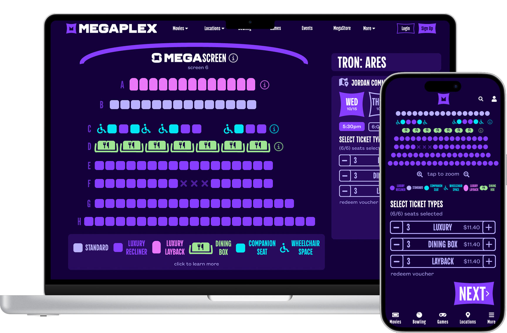
Seat Selection:
Overview:
The seat selection experience was completely reimagined to prioritize speed and clarity. Key improvements included:
Simplified Flow: Consolidated checkout from 7 pages to 3, eliminating redundant steps and unnecessary clicks.
Modern Design: Updated color palette, simplified iconography, and cleaner layouts aligned with Megaplex's rebrand.
New Flexibility Features: Guests can now change showtimes or dates within checkout, access detailed seat type information through a popup, and view theater directions, all without leaving the flow.
Auto-Selected Tickets: Ticket types default to adult, dramatically reducing clicks for most guests while child/senior buyers can easily adjust.
Clearer Naming: Seat types were renamed for instant understanding,"Chaise Luxury Loungers" became "Luxury Laybacks" and "D-Box" simplified to "Motion Seats."
Every change removed friction, making it effortless for guests to find and select their perfect seats.
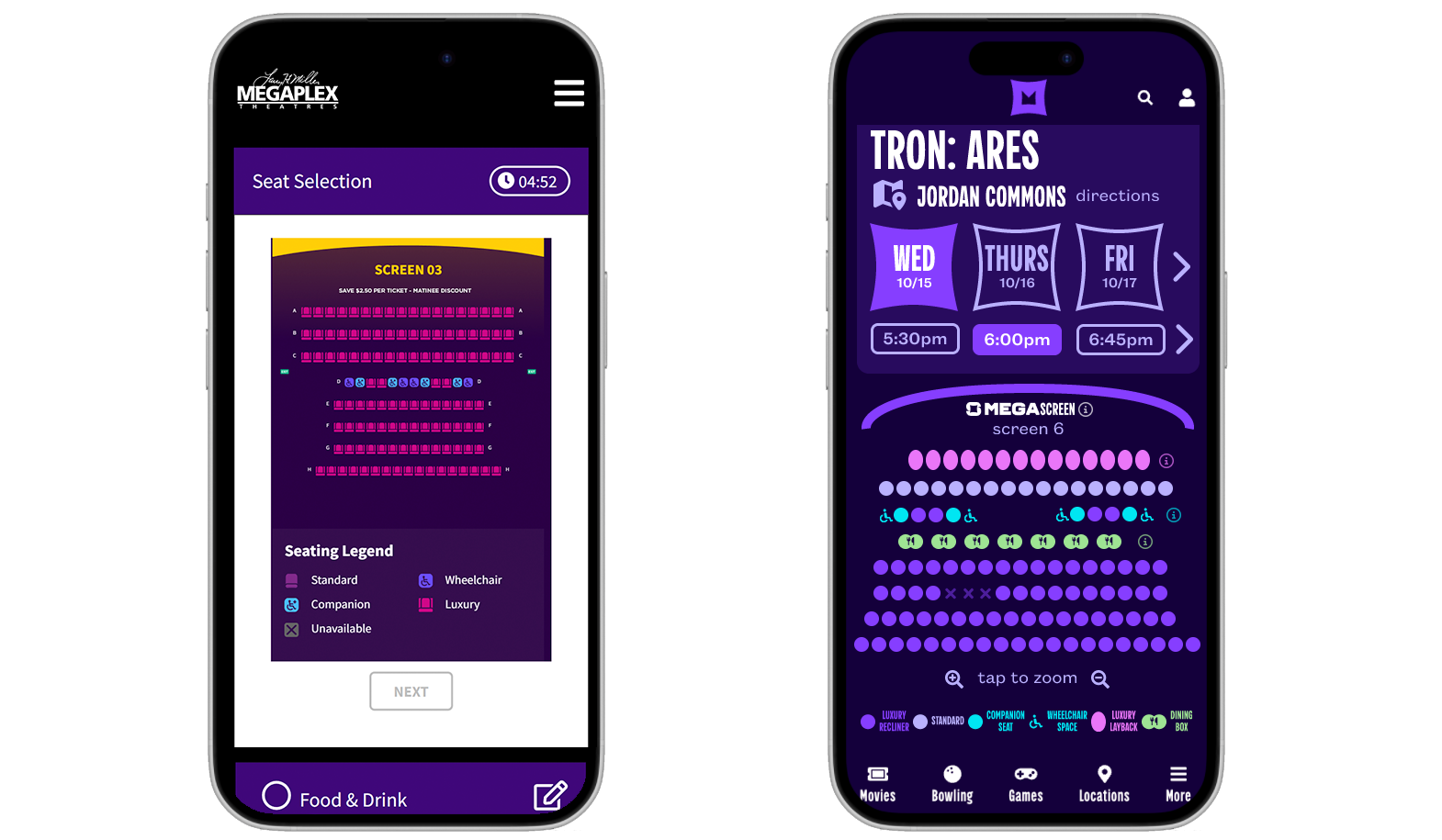
The original mobile layout wasted valuable screen real estate with excessive white space. The new design maximizes efficiency, incorporating new features, consolidating previously separate pages, and introducing simplified icons with on-brand colors that feel modern and cohesive.
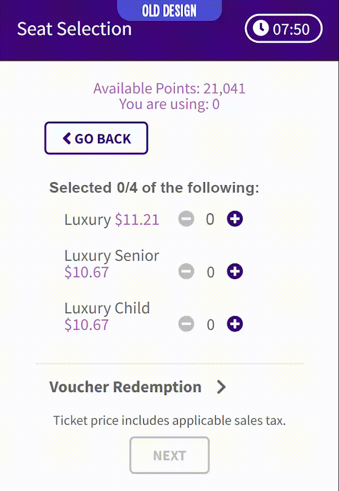
OLD DESIGN: Previously, guests had to manually select each ticket type, creating unnecessary friction in the checkout process.
Major Pain Point:
Previously, guests had to visit a dedicated ticket type page after selecting seats, manually adding each ticket type one by one. For example, buying 4 adult tickets required clicking the “+” button 4 times.
Solution:
In the new design, ticket selection is integrated directly into the seat selection page.
When a guest chooses their seats, the system automatically assigns them as “Adult” tickets by default, instantly filling in the most common choice.
Guests who need senior or child tickets can still adjust their selections, but for the majority of users, the process is now frictionless and intuitive.
This change not only saves time but also removes one of the biggest sources of frustration in the old flow, a problem still common in many competitor checkouts today.
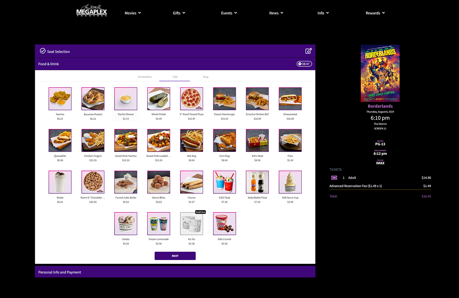
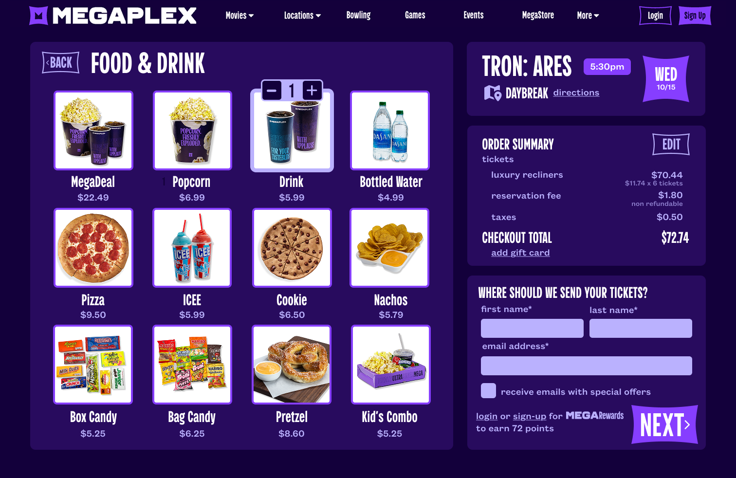
Food & Drink:
The old concessions section bombarded guests with 46 items across 3 tabs, leading to decision paralysis and missed opportunities as customers overlooked entire categories. With 80% of sales coming from just 12 items, we simplified the menu to focus on proven favorites, making it easier to browse and purchase.
Redundancies were eliminated through smart consolidation. Items like "Popcorn," "Small Popcorn," "Cheetos Popcorn," and "Popcorn Lid" became a single entry with a customization popup for sizes and flavors. Guests retain full flexibility without the visual clutter.
We also embedded the personal details section directly on this page, removing an unnecessary step. Guests skipping concessions can now jump straight to checkout completion without an extra click, streamlining the path to purchase even further.
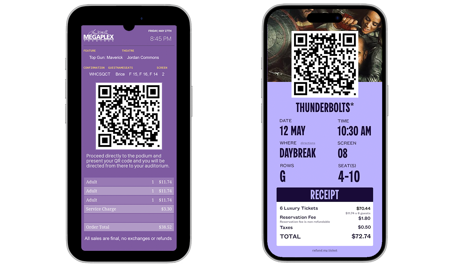
Ticket Confirmation:
The new confirmation page delivers the same information as before but in a significantly more user-friendly format. Text is organized with clear visual hierarchy, making details easy to scan and digest. The layout maximizes screen space without feeling cluttered.
Two key features enhance guest flexibility: a directions button for instant navigation to the theater, and a "refund my ticket" option at the bottom of the page. The refund feature addresses one of our guest services team's most common complaints, empowering customers to handle cancellations independently and providing the control modern audiences expect.
Conclusion:
This redesign transformed Megaplex's checkout from a 12-click obstacle course into a 5.5-click experience that respects guests' time and intelligence. By consolidating pages, eliminating redundancies, and introducing flexibility where it matters, we doubled conversions within the checkout and modernized payment adoption.
Beyond the metrics, we proved that movie theaters can deliver digital experiences as intuitive and polished as any contemporary platform, reinforcing that cinema isn't a relic of the past, but a relevant, modern entertainment choice.
Thank you for reading!